Tips for Creative & Effective Email Designs
You can only stand out from the competition with your emails if you deliver high quality, super relevant and stylish email templates to your audience. Check out our email design tips and make more with your next email campaign!

There are plenty of ways to communicate messages and ideas to your customers through email, but what exactly makes an email copy engaging? The job of an email marketer is unique, but it requires you to prioritize certain email features over another, but make sure you’re paying attention to most influential ones.
Using special, creative tactics will not only capture your audience’s attention, but it can set your company apart from your competitors. In this article, we will discuss the various email features you should pay extra close attention to when designing your next email copy.
Optimize sender’s name, subject line, preview text
- Sender name: helps people to identify who sent the email. So it should contain strong reference to your brand.
- Subject line: to shortly summarize has to grab attention, needs to be personalized and should create a sense of urgency.
- Preview text: has to strengthen the message of the subject line to make people actually open the email.
In the following image from my inbox you can see how different companies use the power of sender name, subject line and preview text to make me open the email.
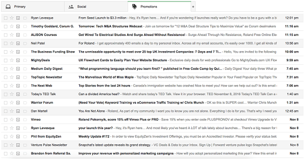
Since I receive hundreds of these messages every day, I’m quite selective about what I open and what not.
- I opened the email from Ryan Levesque since I’m interested in how others grow their business.
- Neil Patel mentioned my name in the subject line, and the “I get approximately 400 emails a day” felt like a problem I also have, so I opened it.
- The TED newsletter was just super relevant because of the elections in the US.
- I was interested what could lie beyond a “You Are Not Alone” subject line, that’s why I opened Dan’s email.
- The Venture Pulse Newsletter was captivating as well, since I’m eager to learn where the online world is heading and Snapchat – although I’m not using their service – as among the shapers of the industry.
It’s easy to improve your subject line and preview text writing method, by simply checking your own inbox for good examples, and writing them down. You’ll learn a lot.
Include a clear call to action button
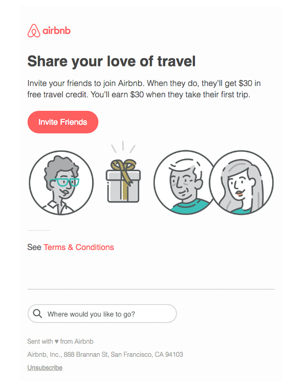
Make it obvious what you want your subscribers to do, and make it as easy as possible for them. Check out the following email from Airbnb.
Source: Really Good Emails
To highlight a helpful referral service, Airbnb sent an email with minimal text to share the details about how users can get involved. Notice the obvious (and only) call to action, to invite friends to use the service.
Provide alternative text to all your images
According to a Mailigen study from 2015, up to 60% of users will automatically block images by default.
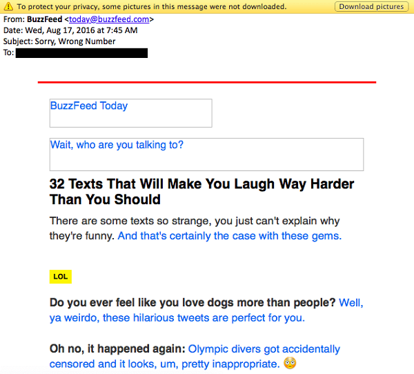
If this is the case, the images in the email will render as empty white boxes if you did not provide alternative text, and your users will have no idea what message you were trying to send to them.
At the bare minimum, alternative text can indicate what the purpose of the image was. In the following example, BuzzFeed used alternative text under their images to give users an idea of what the image represented. This way, the disabled image did not appear simply as an empty white box.
Source: Hubspot
Use animated GIFs
Animated GIFs can be used to communicate your message and visually encourage users to focus on a specific product, service, or event.
A fun and entertaining anim GIF makes it easier to quickly capture your audience’s attention.Check the following image to see how Kate Spade used a GIF to make the email appear as if a present was being unwrapped.

Source: Mail Bakery
Make use of the most visible area – the top left corner.
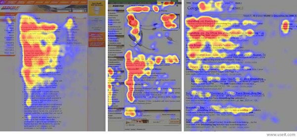
According to a study done by the Nielson Group, people read web pages (and most likely emails too) in an F shaped pattern.
Thus, the buttons and content in the top left corner of the email have the greatest chance of being seen, clicked on, and further engaging your audience.Notice in the following image how the heat maps subtly resemble an F.
The reddest areas appear in the top left corner, where your users eyes’ are concentrated. Try placing the most important information of your email newsletter in top left corner, or on the left side pane.
Source: Nielson Group
Create a balance between images and text
As a preventive measure, you must consider image blocking and how many of your users already have images disabled by default. According to Email on Acid, it is recommended to maintain a text to image ratio of 60/40 to prevent any issues with email deliverability.
Generally, emails that are too image heavy will be caught by spam filters and may not reach your user’s primary inbox. This is why you should make sure to use a combination of visual and text elements to express a message to your audience.
Make the email easy to read and scan
Most likely, your readers will have different reading patterns and it will not always be easy to meet everyone’s needs. To fight this and engage even the most difficult users, make sure your email copy is easy to read and to capture relevant information from. You can do this by organizing your email copy into digestible chunks, where each section has only one idea.
Also, consider the F pattern that was discussed earlier in the article, in which people tend to read emails and create chunks based on this.
For example, check out the following email from GoSquared.
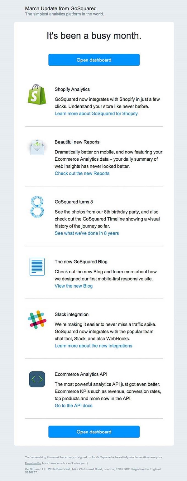
In the beginning of the email, there is a clear call to action to take users to their web service. The copy is also broken into chunks of relevant information for users to decide which content they would like to see more of.
Optimize your emails for mobile
If you want your emails to have the greatest chance of being read, regardless of the user’s chosen device. For example, if a user opens your email on mobile and it doesn’t render correctly, there’s a small chance they will bother to check it on an additional device, or desktop.
In a recent survey from Adobe, 22% of respondents indicated that their biggest annoyance with emails was receiving emails that don’t render correctly on their chosen mobile devices. As of September 2016, up to 56% of all emails are opened on mobile devices. In contrast, desktop and webmail opens have been slowly declining.
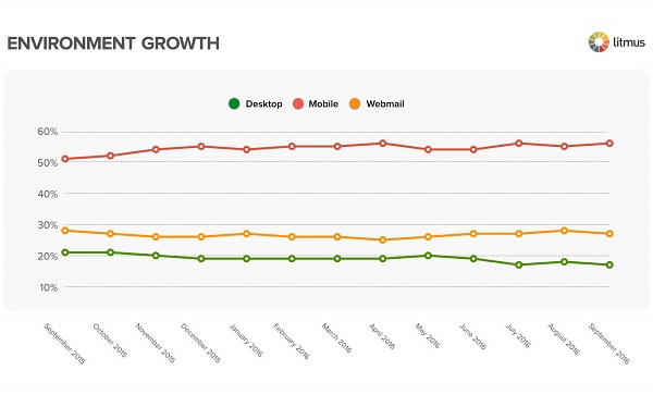
Source: Litmus
Send personalized messages to your users
Based on the information you collect from users, you can send personalized messages that are relevant to their interests, needs, and involvement with your service. For example, messages can be sent only when their interests match the email’s content, or even to celebrate the anniversary of the user becoming a member for your service. A personalized email has a great chance of being received well by your users, because the message is specific to them.In the image below, Jet Blue did exactly that. They sent a personalized email to celebrate a user’s 1 year anniversary of receiving emails from them.
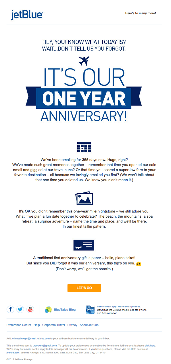
Source: Hubspot
In another example, Warby Parker sent a reminder to users when their eyeglass prescription expires, to encourage them to make a purchase soon. While providing a personalized service, Warby Parker also made it clear what action they desired from users – to purchase new glasses before their prescription expires.
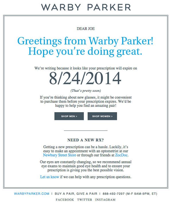
Source: Hubspot
Always test your emails
Finally, make sure to test different email copies to understand what is really preferred by your audience. Testing is the only way to know that your chosen approach is truly the best option for your company.
Clearly, there are many features of your emails to focus on and this article provided only a selection of things to pay attention to.
With these tips, we hope we were able to provide insight on the key features to make your email design not only creative, but effective in engaging your audience and generating conversions.
Original Article